Task: Use the figure created in the previous sub-tasks. Enlarge the text font and make it bold on the axis tick labels. Make the axis lines thicker.
The labeling on figures produced by MATLAB is often too small or too thin to show effectively in documents or in projected slides. Luckily, there is a simple way to make the figure axes bigger and bolder.
The first step is to get the handle for the axis object (which defines both axes, tick marks, labels and other properties). However, when you open a new figure and make a plot, the axes appear automatically. There was no axis creation command from which to get the axis handle.
The command gca ("get current axis") returns the handle for the axis object in the currently open figure (the one that was most recently opened or most recently clicked on). So Ha=gca; will recover the handle for the axis.
There are many properties for Axis objects. We will most often use properties FontSize, FontWeight, and LineWidth which we already know about from Text objects, and they have the same interpretation. The FontName is also the same as for Text objects. We can manipulate these properties with
  figure
    set(gca,'FontSize',16,'FontWeight','bold')
Notice that there was no need to save the axis handle to a separate
variable. The function cga will provide the appropriate
handle when the set command is executed. This specification also affects the
labels and title which are part of the axis. If you want them to be different, set the
axis properties first and then change the label or title properties afterwards.
One of the annoying issues with oceanographic observations is that we want depth (on the y axis) to increase downward. We can set the depth values to be negative which does the trick. But the direction of increase of values on an axis can be set with the property Xdir or Ydir which have the values 'normal' or 'reverse'
We have already seen commands to change the range of values on the two axes. These can be changed through properties Xlim and Ylim which need to have two values (a min and max for the range of values on the axis). Finally, Box can be 'on' or 'off'
There are 3 colors that can be set for Axis objects. The first two are XColor and YColor which define the color to be used for the axis line, the tick marks and the labels on each axis. It does not affect the colors of the labels produced by xlabel and ylabel.
The third is Color. What then, does Color control? This will be the color of the background of the plot (the area inside the axes.
The following script fragment controls several properties of the plot.
  figure
    set(gca,'FontSize',16,'FontWeight','demi')
    set(gca,'Xlim,[0 10],'Ylim',[0 4])
    set(gca,'Xcolor','r','Ycolor','b','Color','w')
    set(gca,'Xdir','normal','Ydir','reverse')
    set(gca,'Box','on')
It is possible to control the location of tick marks (XTick and YTick, which are lists of tick locations) and text next to them (XTickLabel and YTickLabel, which are cell arrays of text strings). Generally, you need to define how many tick marks there will be before assigning values. However, if you want, you can let the tick marks be set up automatically and then change their location and text by manipulating these axis properties.
Flow chart for the task:
Solution script for the task:
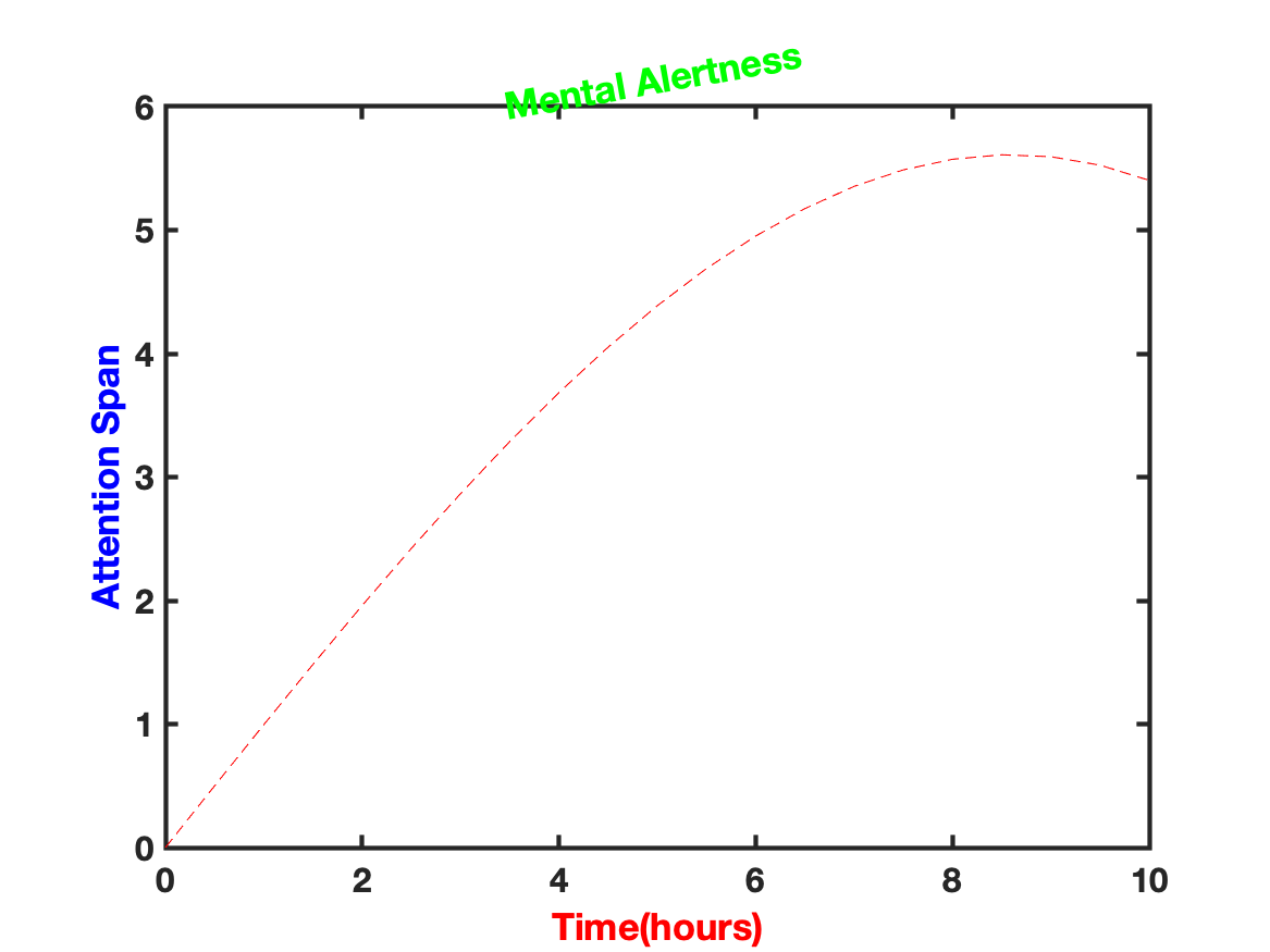
%%%  create t and F
t=0:.5:10;F = t.*cos(.1*t);
figure;
%%%  create the plot and add labels and a title
 Hp=plot(t,F,'r--');
 Hx=xlabel('Time(hours)');
 Hy=ylabel('Attention Span');
 Ht=title('Mental Alertness');
%%%  change the properties of the labels and title
 set(Hx,'FontSize',14,'Color','r')
 set(Hy,'FontSize',15,'Color','b')
 set(Ht,'FontSize',18,'Color','g','Rotation',10)
%%%  change the properties of the axes
 set(gca,'LineWidth',2,'FontSize',15,'FontWeight','bold')